
For the Objectenregister I designed visual overviews that show the distribution of attribute values. For example, a bar chart could show how many songs exist per genre. These charts help users quickly spot trends, identify unusual data, or get a better sense of their data.
Role
UX/UI designer
Product
Objectenregister
Year
2024

The Objectenregister (OR) is a tool that helps organizations manage and understand their assets in a structured way. For a music label, this could include tracking artists, albums, and songs, each with specific attributes like genre, release year, or play count. Instead of only viewing one item at a time, the aim was to give users visual summaries across many objects to spot patterns and gain better insights.
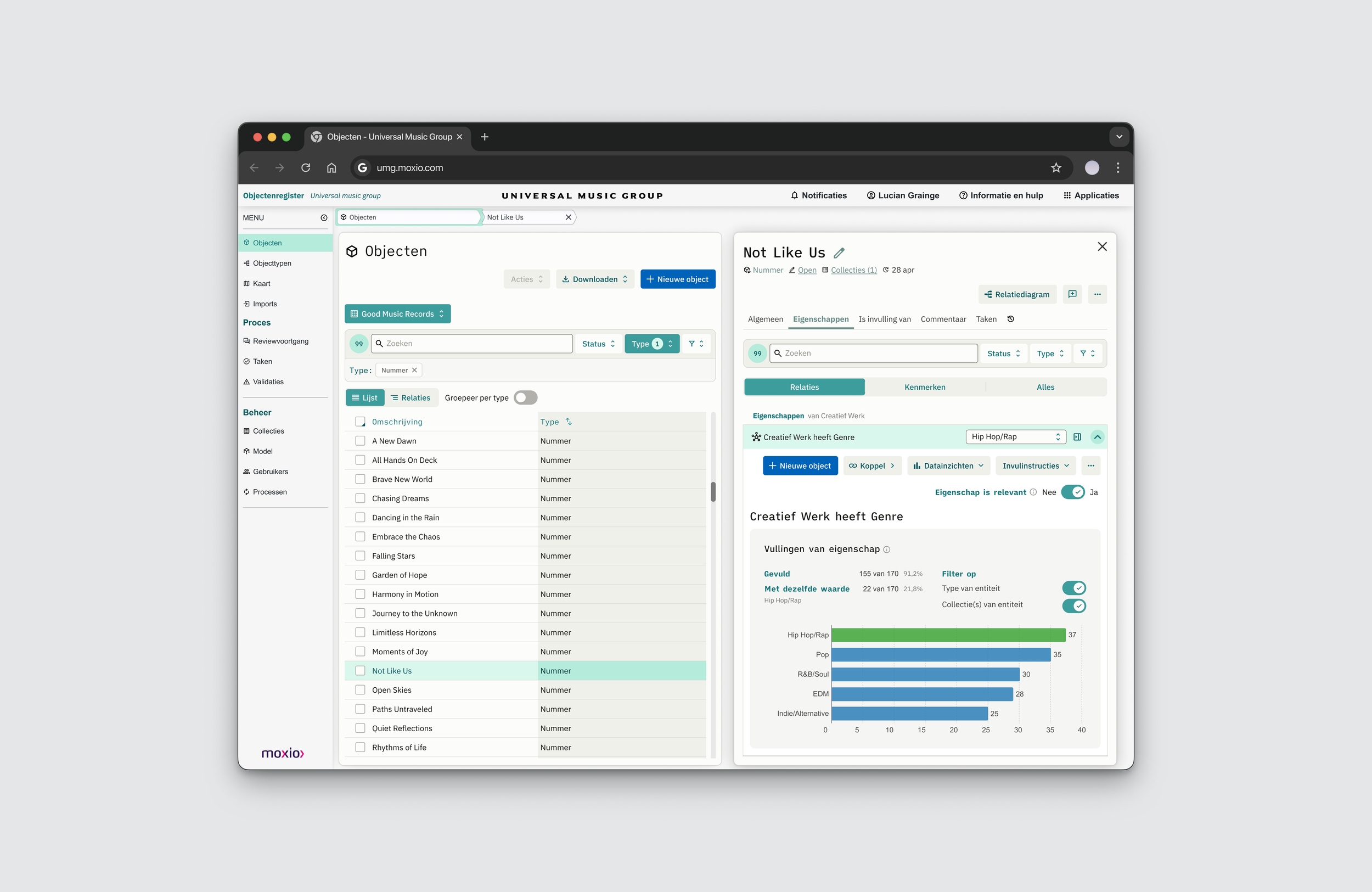
The challenge was to design visual overviews that show the distribution of attribute values. For example, a bar chart could show how many songs exist per genre, or how many albums were released each year. These charts help users quickly spot trends, identify unusual data, or get a better sense of their overall catalog.
This supports Moxio’s broader goal of helping users gain more control and understanding of their data collections. To be successful, the insights need to be easy to find and genuinely useful.
The challenge
The design process
The design process started with stakeholder interviews to understand how users interpret and explore attribute data in the Objectenregister. Users expressed a need for quick, visual summaries to spot trends and outliers without manual effort.
Based on these insights, I created low-fidelity wireframes showing simple charts integrated into the existing interface. The focus was on keeping the visuals clear, lightweight, and accessible within the user’s workflow.
We iterated on the design based on internal feedback and aligned it with our success criteria: insights should be easy to find and genuinely useful. These were validated through usage data statistics and direct client feedback.

The outcome
The outcome was a new feature called Data-inzichten, which users could access in key parts of the interface. For example, in the Objectlist pane, users can filter the type column on a specific attribute and open Data-inzichten for that attribute. The same is possible in the Objectdetail pane, on the Eigenschappen tab. Here users can also filter the bar chart to include only values of objects of the same type and that are in the same collection. This feature is also available in the Matrix pane, where users can edit multiple columns of selected objects. Each column can then open Data-inzichten to show a bar chart displaying the distribution of values in that column for the selected objects. Clients were very pleased to finally be able to visualize the different attribute values across their objects.